BLOOMILK
Case Study: 001
About: Algae based infant formula.
About: Algae based infant formula.
About: Algae based infant formula.
What: Naming, brand strategy, visual system & packaging.
What: Naming, brand strategy, visual system & packaging.
Industry: Consumer goods.
Industry: Consumer goods.
Location: Barcelona, Spain.
Location: Barcelona, Spain.

THE PROJECT
Goal: Strike the perfect balance between warmth and friendliness, and clinical credibility.
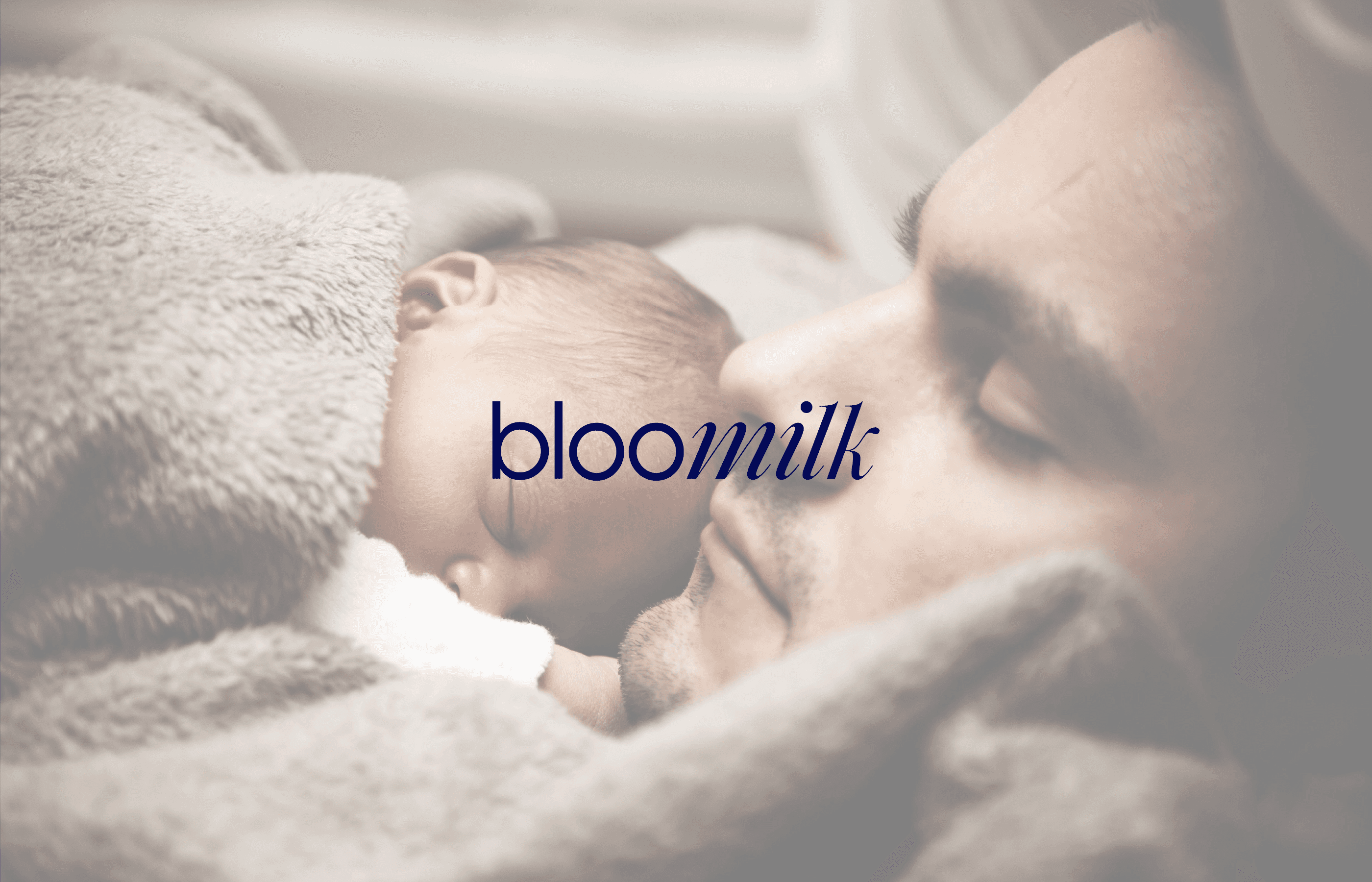
Bloomilk is a brand created for parents who can’t — or choose not to — breastfeed. Speaking to a deeply personal and sensitive stage of life, the brand needed to inspire trust while offering empathy and support on a meaningful level.
The challenge? Creating a visual and verbal identity that feels both medically reliable and emotionally reassuring.
OUR APPROACH
In our research, we identified an underserved segment in the infant nutrition market: LGBTQ+ couples, single fathers, mothers with health conditions that prevent breastfeeding, and women who consciously choose not to breastfeed. Despite their growing presence and unique needs, few — if any — brands speak directly to them with empathy, inclusivity, and clarity.
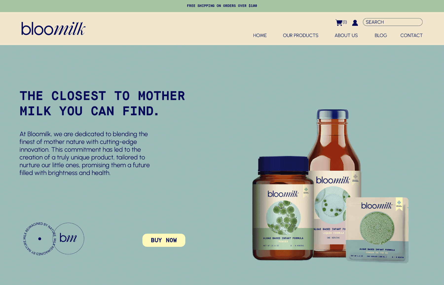
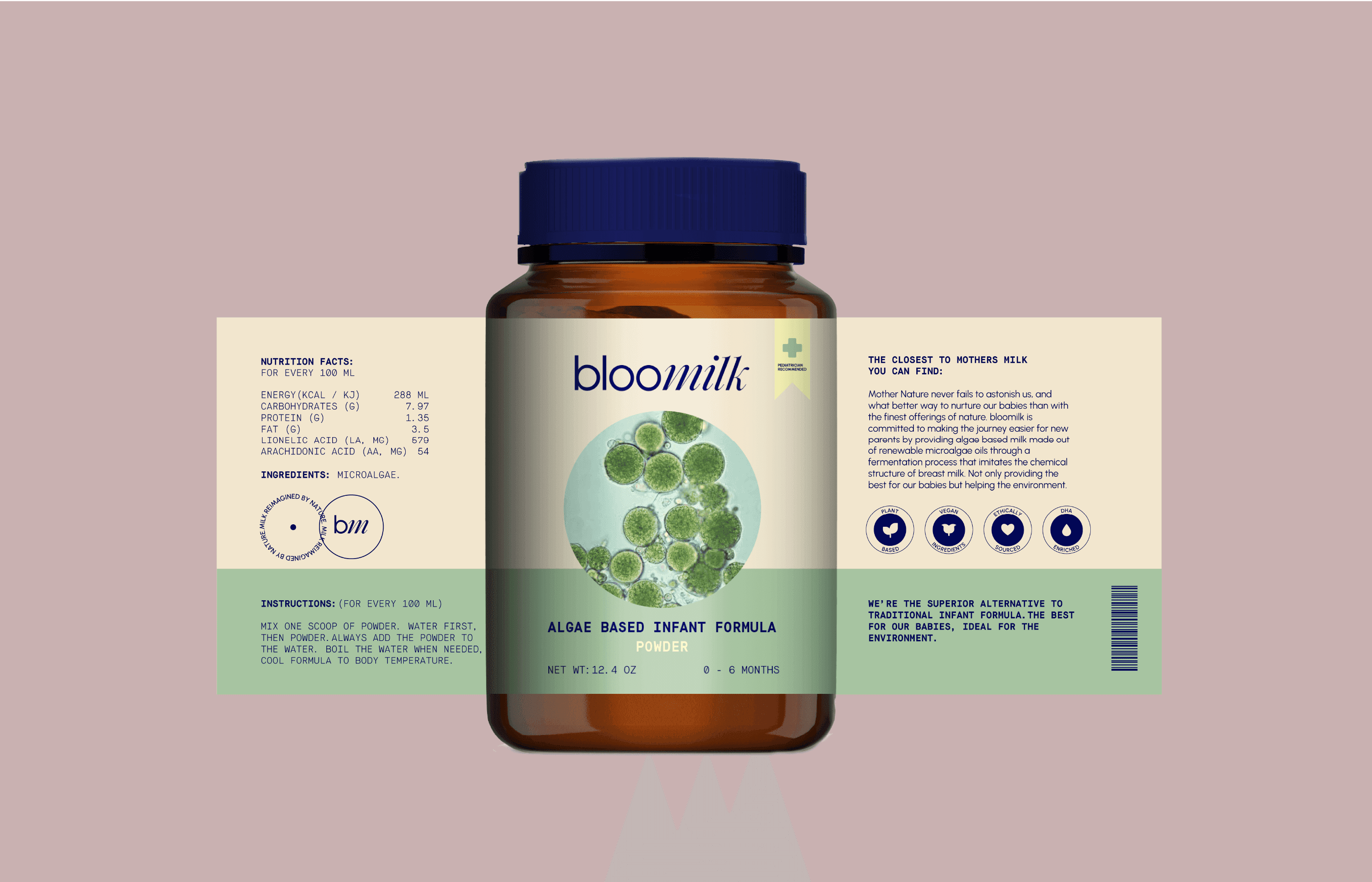
To address this gap, we developed a brand that feels both trustworthy and emotionally resonant. A clean, clinical-inspired visual language communicates product quality and reliability, while soft pastel tones bring warmth and reassurance. The design system features clear, digestible layouts, a refined logotype, and a subtle, meaningful icon — all working together to create a brand that feels both elevated and deeply human.
OUR APPROACH
In our research, we identified an underserved segment in the infant nutrition market: LGBTQ+ couples, single fathers, mothers with health conditions that prevent breastfeeding, and women who consciously choose not to breastfeed. Despite their growing presence and unique needs, few — if any — brands speak directly to them with empathy, inclusivity, and clarity.
To address this gap, we developed a brand that feels both trustworthy and emotionally resonant. A clean, clinical-inspired visual language communicates product quality and reliability, while soft pastel tones bring warmth and reassurance. The design system features clear, digestible layouts, a refined logotype, and a subtle, meaningful icon — all working together to create a brand that feels both elevated and deeply human.

OUTCOME
The result is a flexible, functional visual system designed to perform seamlessly across both digital and print platforms. Every brand asset is crafted with intention — reinforcing Bloomilk’s dual purpose of feeling warm and approachable, while remaining trustworthy and professional.
Grounded in a strong strategic foundation, the brand stands out in a category that often overlooks emotional nuance. It’s not just visually memorable — it’s emotionally meaningful. The system communicates quality, care, and understanding to an audience navigating a deeply personal moment.
Bloomilk doesn’t just speak to them — it sees them. And it’s there for them, every step of the way.